なので自前で作る必要があります。Flashみたいなものです。
ですが、このボタンを作るというがQMLを学ぶ上で重要なことを学べます。
・プロパティバインド
・状態管理
・シグナル
です。
また今後QMLで開発していく上で重要なポイントがあります。
・できるだけプロパティバインドや状態管理で連携する
・シグナルはできるだけ使用しない
(使うのが悪とかNGってわけじゃないですよ)
このあたりをサンプルを見ながら解説します。
3種類作ります。
最終的にちょっと今風のデザインにしてみます。
まずはシンプルなボタンを作ります。
機能は
・好きな文字列を表示
・クリックしたら赤くなる
・マウスオーバーで青くなる
・文字列に合わせてサイズを調節する
ソースの上の方から
「Text」エレメントの「paintedWidth」「paintedHeight」で文字列を描画した結果のサイズが分かります。
これでボタン自体の大きさを調節します。
「signal clicked(variant mouse)」で上位へ通知するシグナルを宣言します。
上位で「onClicked」としてシグナルを受け取れます。
「MouseArea」エレメントをルートエレメント全体に配置してイベントを受取ります。
クリックイベントが発生したら自分で宣言したclickedシグナルを呼び出します。
(C++なら emit clicked(mouse);って感じです。)
これは「MouseArea」エレメントに標準で無い機能なので拡張しているわけです。
(間違いでした、「containsMouse」プロパティで判定できます。)
ボタンのルートエレメント(Rectangle)に指定した「states」プロパティにボタンが押された時とマウスオーバーしてる時の状態を2つ追加して色が変化するように指定しています。
「State」エレメントの「when」プロパティに変化に追従させたいプロパティを指定します。
「when: _mouse.pressed」とするとマウスが押されている時にその状態になります。
「when: _mouse.containsMouse」とするとマウスがエリア内にいる時に状態が変化します。
呼び出し側のqmlファイル
import QtQuick 1.1

Rectangle {
    width: 360
    height: 360
    Column{
        anchors.centerIn: parent
        spacing: 10

        //ボタンの状態をデバッグ表示
        Text {
            id: _text
            anchors.horizontalCenter: parent.horizontalCenter
            text: "デバッグ文字列"
        }

        ButtonSimple{
            text: "1.シンプルボタン"
            onClicked: {
                _text.text = "1をクリック"
            }
        }
    }
}
ボタンのqmlファイル
//ButtonSimple.qml
import QtQuick 1.1

Rectangle {
    id: _root
    //文字列にあわせてサイズを調節
    width: _label.paintedWidth * 1.2
    height: _label.paintedHeight * 2
    //枠線
    border.width: 1
    border.color: "#dddddd"

    property alias text: _label.text     //ボタンのキャプションへのエイリアス

    //クリックシグナル
    signal clicked(variant mouse)

    //ボタンのキャプション
    Text{
        id: _label
        anchors.centerIn: parent
        text: "ボタン"
    }

    //マウスイベント処理
    MouseArea{
        id: _mouse
        anchors.fill: parent
        hoverEnabled: true                  //ホバーイベントONする
        //シグナル発生時の処理を{}で囲わずに1行でも書ける
        onClicked: _root.clicked(mouse)     //クリックされたらシグナル呼出し
    }

    //状態管理
    states: [
        //マウスダウンで赤くするステート
        State {
            name: "Press"
            when: _mouse.pressed        //フラグの変化に自動追従
            PropertyChanges {
                target: _root           //プロパティを変更したい対象を指定
                color: "#ddaaaa"        //変更するプロパティは複数でもOK
                border.color: "#dd0000"
            }
        }
        //マウスオーバーで青くするステート
        , State{
            name: "Hover"
            when: _mouse.containsMouse    //フラグの変化に自動追従
            PropertyChanges {
                target: _root
                color: "#8888dd"
            }
        }
    ]
}
なんとなくボタンっぽい動作をするエレメントが作成できました。
しかし、これちょっといけてません。
最初に書いた「シグナルはできるだけ使用しない」を無視してます。
サンプルでは「clicked」だけシグナル定義していますが上位に「MouseArea」が持っているイベントを全て通知したい場合はいちいち記述しないといけなくなって煩雑になってしまいます。
最初の頃なんとなくやってしまいガチで自分もやってました。
なのでそのあたりを修正しました。
ルートを「MouseArea」エレメントに変更して見た目は内側に「Rectangle」エレメントなどを配置して対応します。
これで「MouseArea」のイベントを上位に伝えるのが簡単になります。
特に宣言を増やす必要はなくなります。
呼び出し側のqmlファイル
import QtQuick 1.1

Rectangle {
    width: 360
    height: 360
    Column{
        anchors.centerIn: parent
        spacing: 10

        //ボタンの状態をデバッグ表示
        Text {
            id: _text
            anchors.horizontalCenter: parent.horizontalCenter
            text: "デバッグ文字列"
        }

        ButtonSimple2{
            text: "2.シンプルボタン"
            onClicked: {
                _text.text = "2をクリック"
            }
            onEntered: {
                _text.text = "2のエリアに入った"
            }
            onExited: {
                _text.text = "2のエリアを出た"
            }
            onPressAndHold: {
                _text.text = "2を長押しした"
            }
        }
}
ボタンのqmlファイル(改良版)
//ButtonSimple2.qml
import QtQuick 1.1

MouseArea {
    id: _root
    //文字列にあわせてサイズを調節
    width: _label.paintedWidth * 1.2
    height: _label.paintedHeight * 2
    //ホバー設定
    hoverEnabled: true                  //ホバーイベントONする

    property alias text: _label.text    //ボタンの文字列へのエイリアス

    //見た目
    Rectangle{
        id: _bg
        anchors.fill: parent
        //枠線
        border.width: 1
        border.color: "#dddddd"

        //ボタンのキャプション
        Text{
            id: _label
            anchors.centerIn: parent
            text: "ボタン"
        }
    }

    //状態管理
    states: [
        //マウスダウンで赤くするステート
        State {
            name: "Press"
            when: _root.pressed         //フラグの変化に自動追従
            PropertyChanges {
                target: _bg             //プロパティを変更したい対象を指定
                color: "#ddaaaa"        //変更するプロパティは複数でもOK
                border.color: "#dd0000"
            }
        }
        //マウスオーバーで青くするステート
        , State{
            name: "Hover"
            when: _root.containsMouse   //フラグの変化に自動追従
            PropertyChanges {
                target: _bg
                color: "#8888dd"
            }
        }
    ]
}
さて、これではちょっと見た目が寂しいのでちょっと今風にしてみましょう。
グラデーションを使ってハイライトを入れてます。
「Rectable」エレメントの「gradient」プロパティに「Gradient」エレメントを使用してグラデーションを指定します。
呼び出し側のqmlファイル
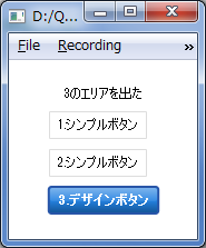
import QtQuick 1.1

Rectangle {
    width: 360
    height: 360
    Column{
        anchors.centerIn: parent
        spacing: 10

        //ボタンの状態をデバッグ表示
        Text {
            id: _text
            anchors.horizontalCenter: parent.horizontalCenter
            text: "デバッグ文字列"
        }

        ButtonSimple{
            text: "1.シンプルボタン"
            onClicked: {
                _text.text = "1をクリック"
            }
        }
        ButtonSimple2{
            text: "2.シンプルボタン"
            onClicked: {
                _text.text = "2をクリック"
            }
            onEntered: {
                _text.text = "2のエリアに入った"
            }
            onExited: {
                _text.text = "2のエリアを出た"
            }
            onPressAndHold: {
                _text.text = "2を長押しした"
            }
        }
        ButtonDesign{
            text: "3.デザインボタン"
            onClicked: {
                _text.text = "3をクリック"
            }
            onEntered: {
                _text.text = "3のエリアに入った"
            }
            onExited: {
                _text.text = "3のエリアを出た"
            }
            onPressAndHold: {
                _text.text = "3を長押しした"
            }
        }
    }
}
ちょっと今風にしたボタン
//ButtonDesign.qml
import QtQuick 1.1

MouseArea {
    id: _root
    width: _label.paintedWidth * 1.2
    height: _label.paintedHeight * 2
    //ホバー設定
    hoverEnabled: true                  //ホバーイベントONする

    property alias text: _label.text    //ボタンの文字列へのエイリアス

    //ボタン全体の見た目
    Rectangle {
        id: _background
        anchors.fill: parent
        border.color: "#2855a8"
        border.width: 2
        radius: parent.height * 0.1
        smooth: true
        //上から下に明るい青から暗い青へのグラデーション
        gradient: Gradient {
            GradientStop {id: _gradBg1;  position: 0.0;  color: "#2582e1"}
            GradientStop {id: _gradBg2;  position: 0.5;  color: "#2582e1"}
            GradientStop {id: _gradBg3;  position: 1.0;  color: "#135393"}
        }
        //上半分にハイライトを入れる
        Rectangle {
            height: parent.height / 2
            anchors.top: parent.top
            anchors.left: parent.left
            anchors.right: parent.right
            anchors.margins: 1
            radius: _background.radius
            smooth: true
            //半透明の白のグラデーション
            gradient: Gradient {
                GradientStop {id:_grad1;  position: 0.0;  color: "#66FFFFFF";}
                GradientStop {id:_grad2;  position: 1.0;  color: "#11FFFFFF";}
            }
        }

        //ボタンのラベル
        Text {
            id: _label
            anchors.centerIn: parent
            text: "ボタン"
            color: "white"
            font.bold: true
            verticalAlignment: Text.AlignVCenter
            horizontalAlignment: Text.AlignHCenter
        }
    }

    //状態管理
    states: [
        //マウスダウンで赤くするステート
        State {
            name: "Press"
            when: _root.pressed
            PropertyChanges { target: _gradBg1; color: "#e42d4b" }
            PropertyChanges { target: _gradBg2; color: "#e42d4b" }
            PropertyChanges { target: _gradBg3; color: "#931a2e" }
            PropertyChanges { target: _background;  border.color: "#931a2e" }
        }
        //マウスオーバーでオレンジにするステート
        , State {
            name: "Hover"
            when: _root.containsMouse
            PropertyChanges { target: _gradBg1; color: "#e89223" }
            PropertyChanges { target: _gradBg2; color: "#e89223" }
            PropertyChanges { target: _gradBg3; color: "#935e1a" }
            PropertyChanges { target: _background;  border.color: "#935e1a" }
        }
    ]
}
以上ですが、「Rectangle」の代わりに「Image」を置いて画像を使用したボタンを作るのも簡単にできます。
Kenji Sugita
ホバーの判定は、containsMouseでよいのではないでしょうか。
あやね
> Kenji Sugitaさん
指摘ありがとうございます。
containsMouseでした。
(前にも似たような事があったような・・・。)