アプリの設定項目で数値を入力して欲しい場合があると思います。
そんな時に利用します。
特に、数値を入力させたいけどそんな細かくなくていいとか数値以外の文字を入れられた時のエラーチェックがめんどいとか考えた結果のできばえです。 Windowsスピンボタン的なのが欲しいところなのですが、見たまんま実装するとはっきり言って操作しづらいのでこんなデザインで実装して見ました。
(某Androidかいわいですごい人が少し前に作ってたののパクリとか言わないでね)
こんな感じ
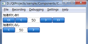
なんのひねりもないですけど。
/// 今回のポイント ///
・数値の増減量を2種類設定できるようにボタンを計4つ
・増減大用のボタンは表示/非表示を切り替えできる
・保持している(表示している)値は、「value」プロパティに保存してる
値が変化した時のイベントは「onValueChanged」イベントハンドラでOK
ボタンのデザインが変わってます。
サンプルコードをGoogleCodeにアップしました。
Components for Qt Quick(QML)
/// サンプルコード ///
使い方
今回の本命のエレメントのコード
おまけのボタンのコード
<Category : Qt>
そんな時に利用します。
特に、数値を入力させたいけどそんな細かくなくていいとか数値以外の文字を入れられた時のエラーチェックがめんどいとか考えた結果のできばえです。 Windowsスピンボタン的なのが欲しいところなのですが、見たまんま実装するとはっきり言って操作しづらいのでこんなデザインで実装して見ました。
(某Androidかいわいですごい人が少し前に作ってたののパクリとか言わないでね)
こんな感じ
なんのひねりもないですけど。
/// 今回のポイント ///
・数値の増減量を2種類設定できるようにボタンを計4つ
・増減大用のボタンは表示/非表示を切り替えできる
・保持している(表示している)値は、「value」プロパティに保存してる
値が変化した時のイベントは「onValueChanged」イベントハンドラでOK
ボタンのデザインが変わってます。
サンプルコードをGoogleCodeにアップしました。
Components for Qt Quick(QML)
/// サンプルコード ///
使い方
//main.qml

import QtQuick 1.0
import "Components"

Rectangle {
    width: 360
    height: 360

    Column{
        anchors.fill: parent
        anchors.margins: 5
        spacing: 5

        Text{
            text:"加速ボタンあり"
        }
        NumberBox{
            min: -10
            max: 1010
            step: 100
            stepAccelerate: 200
            accelerate: true
        }
        Text{
            text:"加速ボタンなし"
        }
        NumberBox{
            min: -10
            max: 1010
            step: 100
            stepAccelerate: 200
            accelerate: false
        }
    }

}
今回の本命のエレメントのコード
// ./Components/NumberBox.qml

import QtQuick 1.0

Row{
    id: _root
    height: 20
    spacing: 3

    property int value: 50              // 値
    property int min: 0                 // 最小値
    property int max: 100               // 最大値
    property int step: 10               // 増減量
    property int stepAccelerate: 50     // 増減量(加速ボタン)
    property bool accelerate: false     // 加速ボタンあり?

    property int buttonWidth: 50        // ボタンの横幅
    property int textWidth: 50          // テキストの横幅


    // 値を更新する
    function updateValue(step){
        var temp = value + step;
        if(temp < min){
            value = min;
        }else if(temp > max){
            value = max;
        }else{
            value = temp;
        }
    }

    Button{
        width: buttonWidth
        height: _root.height
        text:"<<"
        visible: accelerate
        onClicked: {
            updateValue(-1 * stepAccelerate);
        }
    }
    Button{
        width: buttonWidth
        height: _root.height
        text:"<"
        onClicked: {
            updateValue(-1 * step);
        }
    }
    Rectangle{
        width: textWidth
        height: _root.height
        border.color: "#dddddd"
        border.width: 2

        Text {
            id: _number
            anchors.centerIn: parent
            horizontalAlignment: Text.AlignHCenter
            verticalAlignment: Text.AlignVCenter
            text: value
            font.pixelSize: parent.height * 0.8
            onTextChanged: {
                if(text.length === 0){
                }else{
                    value = parseInt(text);
                }
            }
        }
    }
    Button{
        width: buttonWidth
        height: _root.height
        text:">"
        onClicked: {
            updateValue(step);
        }
    }
    Button{
        width: buttonWidth
        height: _root.height
        text:">>"
        visible: accelerate
        onClicked: {
            updateValue(stepAccelerate);
        }
    }
}
おまけのボタンのコード
// ./Compnents/Button.qml

import QtQuick 1.0

MouseArea {
    id: _root
    width: 100//_label.width * 1.2
    height: _label.font.pixelSize * 1.2

    property alias text: _label.text
    property alias font: _label.font

    signal pressKey(int key)

    Rectangle {
        id: _background
        anchors.fill: parent
        border.color: "#2855a8"
        border.width: 2
        radius: parent.height * 0.1
        smooth: true
        gradient: Gradient {
            GradientStop {id: _gradBg1;  position: 0.0;  color: "#2582e1"}
            GradientStop {id: _gradBg2;  position: 0.5;  color: "#2582e1"}
            GradientStop {id: _gradBg3;  position: 1.0;  color: "#135393"}
        }

        Rectangle {
            height: parent.height / 2
            anchors.top: parent.top
            anchors.left: parent.left
            anchors.right: parent.right
            anchors.margins: 1
            radius: _background.radius
            gradient: Gradient {
                GradientStop {id:_grad1;  position: 0.0;  color: "#66FFFFFF";}
                GradientStop {id:_grad2;  position: 1.0;  color: "#11FFFFFF";}
            }
            smooth: true
        }
    }


    Text {
        id: _label
        anchors.fill: parent
        text: "ボタン"
        color: "white"
        font.bold: true
        verticalAlignment: Text.AlignVCenter
        horizontalAlignment: Text.AlignHCenter
    }

    //キーイベント
    Keys.onPressed: {
        pressKey(event.key);
    }

    states: [
        State {
            name: "pressed"
            when: _root.pressed
            PropertyChanges { target: _gradBg1; color: "#e42d4b" }
            PropertyChanges { target: _gradBg2; color: "#e42d4b" }
            PropertyChanges { target: _gradBg3; color: "#931a2e" }
            PropertyChanges { target: _label; anchors.leftMargin: 3 }
            PropertyChanges { target: _label; anchors.topMargin: 3 }
        },
        State {
            name: "forcus"
            when: _root.focus
            PropertyChanges { target: _gradBg1; color: "#e89223" }
            PropertyChanges { target: _gradBg2; color: "#e89223" }
            PropertyChanges { target: _gradBg3; color: "#935e1a" }
        }
    ]
}

