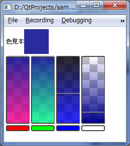
こんな感じ
/// スクリーンショット ///
/// 今回のポイント ///
・グラデーションは縦方向にしかできない。
・クリップは真四角しかできない。
グラデーションは縦方向にしかできない
パフォーマンスの関係で現状縦方向のみのサポートだそうです。
横向きにしたい場合はグラデーションをかけるエレメントを「rotation」プロパティで90度回転させる必要があります。(ヘルプに書いてありますけどね。)
ただし、この回転にはクセがあるので注意です。
レイアウト的な縦横サイズはそのままで見た目だけ回転するので縦横のサイズが違う場合におかしなことになります。
なので、目的のサイズのItemの中に回転したRectangleを置くなど工夫が必要です。
クリップは真四角しかできない
これもパフォーマンスの関係とヘルプに書いてあるのですが。
例えば、Rectangleの中にImageを全体的に貼りつけて、Rectangleを「radius」プロパティで角丸にすると画像の角がはみ出ます。
なので、「clip」プロパティをtrueにすればOKかと思いきやはみ出ます。
サポートされてないので当たり前ですがそおいうことなので注意です。
機能的な話では以下の3点でしょうか。
・色を作成するバーのみを作って見本は別で自由にできる。
・バーはどのあたりを選ぶとどんな色になるかわかる表現をする。
・アルファのバーはプロパティで消せる
・ColorPikcker全体の横幅にあわせて自動で配置されます。
・バーの1つずつの幅を調整したい場合は、rowSpacingを調整する。
サンプルについて
今回のサンプルはあくまでバーの部分だけです。
色見本は別で作ってます。
余談ですが、プロパティバインディングほんとイイヨネ!って内容です。
今までの「作ってみたシリーズ」でも使いまくってますけど。
QMLの強みですね。
GooleCodeにコード置いてあります。
「Componentsサンプル」
使い方
import QtQuick 1.0
import "Components"

Rectangle {
    width: 360
    height: 360

    Column{
        anchors.fill: parent
        anchors.margins: 5
        spacing: 5

        Row{
            Text{
                anchors.verticalCenter: parent.verticalCenter
                text: "色見本"
            }
            Rectangle{
                width: 50
                height: 50
                color: _colorPicker.value
            }
        }


        ColorPicker{
            id: _colorPicker
            useAlpha: true
        }
    }

}
バーをまとめた全体
// ColorPicker.qml

import QtQuick 1.0

Rectangle {
    id: _root
    width: 200
    height: 150

    // トータルの色
    property color value: Qt.rgba(_barRed.value
                                  , _barGreen.value
                                  , _barBlue.value
                                  , _barAlpha.value)
    // 個別の色
    property alias red: _barRed.value
    property alias green: _barGreen.value
    property alias blue: _barBlue.value
    property alias alpha: _barAlpha.value

    // バーの横幅(これは外から操作すべきじゃない)
    property real barWidth: width / _bar.children.length
                            - _bar.spacing * (_bar.children.length - 1) / _bar.children.length

    // バーの隙間
    property alias rowSpacing: _bar.spacing
    // バーの枠関係の情報
    property int borderWidth: 2
    property color borderColor: "#444444"
    property int borderRadius: 2

    // アルファ使うか
    property alias useAlpha: _barAlpha.visible

    Column{
        anchors.fill: parent
        spacing: 5

        // 色選択バー
        Row{
            id: _bar
            height: parent.height * 0.9
            spacing: 5

            // 赤のバー
            ColorPickerBar{
                id: _barRed
                width: barWidth
                border.width: borderWidth
                border.color: borderColor
                radius: borderRadius
                viewRedMin: 0.0
                viewRedMax: 1.0
                viewGreenMin: _barGreen.value
                viewGreenMax: _barGreen.value
                viewBlueMin: _barBlue.value
                viewBlueMax: _barBlue.value
                viewAlphaMin: _barAlpha.value
                viewAlphaMax: _barAlpha.value
            }

            // 緑のバー
            ColorPickerBar{
                id: _barGreen
                width: barWidth
                border.width: borderWidth
                border.color: borderColor
                radius: borderRadius
                viewRedMin: _barRed.value
                viewRedMax: _barRed.value
                viewGreenMin: 0.0
                viewGreenMax: 1.0
                viewBlueMin: _barBlue.value
                viewBlueMax: _barBlue.value
                viewAlphaMin: _barAlpha.value
                viewAlphaMax: _barAlpha.value
            }
            // 青のバー
            ColorPickerBar{
                id: _barBlue
                width: barWidth
                border.width: borderWidth
                border.color: borderColor
                radius: borderRadius
                viewRedMin: _barRed.value
                viewRedMax: _barRed.value
                viewGreenMin: _barGreen.value
                viewGreenMax: _barGreen.value
                viewBlueMin: 0.0
                viewBlueMax: 1.0
                viewAlphaMin: _barAlpha.value
                viewAlphaMax: _barAlpha.value
            }
            // アルファのバー
            ColorPickerBar{
                id: _barAlpha
                width: barWidth
                border.width: borderWidth
                border.color: borderColor
                radius: borderRadius
                viewRedMin: _barRed.value
                viewRedMax: _barRed.value
                viewGreenMin: _barGreen.value
                viewGreenMax: _barGreen.value
                viewBlueMin: _barBlue.value
                viewBlueMax: _barBlue.value
                viewAlphaMin: 0.0
                viewAlphaMax: 1.0

                value: 1.0
            }
        }

        // 色説明的なの
        Row{
            height: parent.height - _bar.height - parent.spacing
            spacing: _bar.spacing
            // red
            Rectangle{
                width: _barRed.width
                height: parent.height
                color: "#ff0000"
                border.width: _barRed.border.width
                border.color: _barRed.border.color
                radius: _barRed.radius
            }
            // green
            Rectangle{
                width: _barGreen.width
                height: parent.height
                color: "#00ff00"
                border.width: _barGreen.border.width
                border.color: _barGreen.border.color
                radius: _barGreen.radius
            }
            // blue
            Rectangle{
                width: _barBlue.width
                height: parent.height
                color: "#0000ff"
                border.width: _barBlue.border.width
                border.color: _barBlue.border.color
                radius: _barBlue.radius
            }
            // alpha
            Rectangle{
                width: _barAlpha.width
                height: parent.height
                color: "#ffffffff"
                border.width: _barAlpha.border.width
                border.color: _barAlpha.border.color
                radius: _barAlpha.radius
                visible: _barAlpha.visible
            }
        }
    }
}
バー1つずつ
// ColorPickerBar.qml

import QtQuick 1.0

Rectangle{
    id: _root
    width: parent.width
    height: parent.height
    clip: true

    // 自分自身の色の強さ
    property real value: 0
    // 表示色用のパラメータ
    property real viewRedMin: 0.0
    property real viewRedMax: 1.0
    property real viewGreenMin: 0.0
    property real viewGreenMax: 1.0
    property real viewBlueMin: 0.0
    property real viewBlueMax: 1.0
    property real viewAlphaMin: 0.0
    property real viewAlphaMax: 1.0

    // 透けたときに見える背景
    Image{
        anchors.fill: parent
        fillMode: Image.Tile
        source: "./images/alpha_background.png"
    }
    // 色見本のグラデーション
    Rectangle{
        anchors.fill: parent
        radius: parent.radius
        border.color: parent.border.color
        border.width: parent.border.width
        gradient: Gradient {
            GradientStop {position: 0.0;  color: Qt.rgba(viewRedMin, viewGreenMin, viewBlueMin, viewAlphaMin)}
            GradientStop {position: 1.0;  color: Qt.rgba(viewRedMax, viewGreenMax, viewBlueMax, viewAlphaMax)}
        }
    }
    // ポインタ
    Rectangle{
        x: parent.border.width
        y: parent.height * value
        width: parent.width - parent.border.width * 2
        height: 2
        color: "#bbbbbb"
        Rectangle{
            anchors.bottom: parent.bottom
            x: 0
            width: parent.width
            height: 1
            color: "#333333"
        }
    }

    // 色変更用のクリックイベント
    MouseArea{
        anchors.fill: parent
        onMousePositionChanged: {
            // 自分の色を変更する
            _root.value = mouse.y / height;
            if(_root.value > 1.0){
                _root.value = 1.0;
            }else if(_root.value < 0.0){
                _root.value = 0.0;
            }
        }
    }
}
コメント